ZEP
How do you get your brand to work as hard as your products?
Zep cleaning products are for professional, semi-pro, and DIY consumers. They’ve been amazingly effective and reasonably priced for generations, but the brand had lost some appeal and didn’t resonate with modern DIY shoppers. Zep turned it around and went from mouse to lion in the professional cleaning products category through a contemporary brand strategy refresh and package redesign.
Client
Zep
Category
Household Cleaning
Services
Consumer Insights
Landscape Assessment
Positioning & Charter
Design Strategy
Package Design
Realization & Commercialization
Awards
Zep Cleaning Products | GD USA | 2019 Package Design
Background
When it comes to cleaning products, performance is king. Nobody wants to do the job over because of poor results. Enter Zep. Since 1937, this unsung hero in cleaning products has created highly effective, reasonably priced, professional-grade formulations for almost any cleaning task. But the brand had become dated and irrelevant to its core audience. Competing with strong brands like Clorox and Tilex in heavily congested shelf sets, shoppers simply overlooked it. It was time for a major brand renovation.
Redefine the Zep Brand
Before rushing into the design, the COHO and Zep leadership team needed to answer fundamental strategic questions about the brand: Who are we? What are we? Who is our audience? And why are we right for them? Through a fast and agile approach, including a landscape assessment, consumer shop-alongs, and co-creation, Zep was ready to renew its focus on cleaning professionals and those who aspire to be.
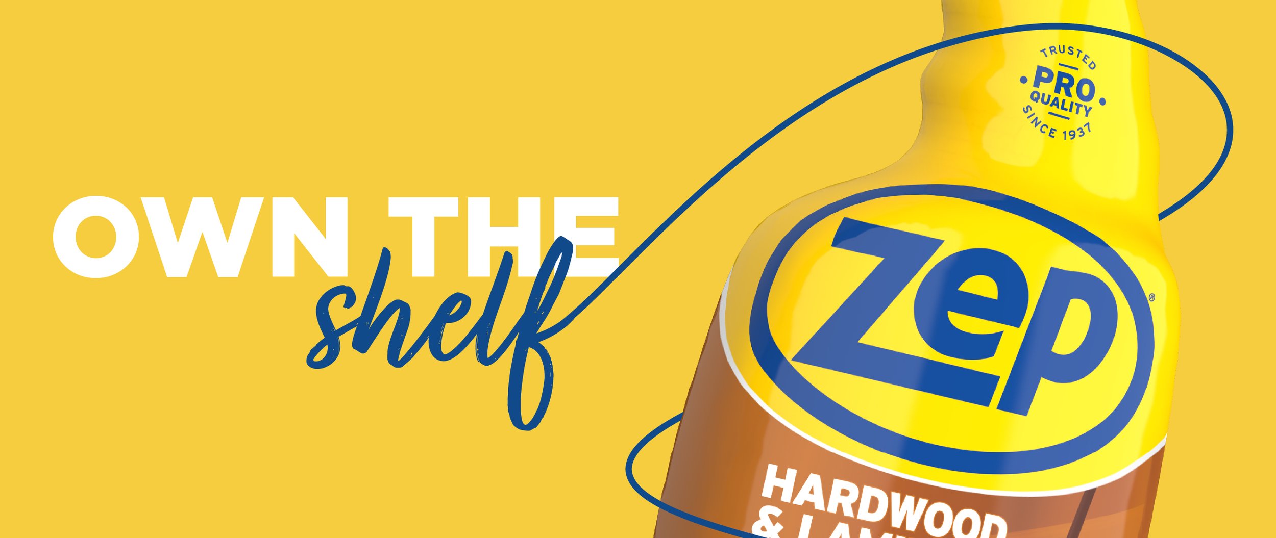
Own the Shelf
Start with color. If you want to stop shoppers, capture attention, and gain perception as the category leader, start with big areas of bold color. The Zep identity had been yellow on blue for years, but we flipped that around to leverage the stopping power of bright yellow. It forms the base of the simplified logo and the visual foundation for all the brand’s packaging. Because Zep has such a wide range of products, this bright yellow swoosh stakes a claim over vast swaths of the shelf set, making the brand impossible to miss.
Be Bold and Proud
Zep needed to scream confidence and pride. So, we made the logo as big as possible, even cropping part of it off the package to imply that Zep couldn’t be contained. Next, we improved the communication hierarchy, making the name and descriptors bold and easy to find. We added a PRO-quality seal to remind consumers about the brand’s trusted heritage since 1937. And finally, we added Pro Tips, reinforcing the brand’s professional credibility and know-how. We even added product names that are readable from above when the products are in a cleaning bucket with others.
Results
The renovated brand and packaging arrived on the shelf in late 2018. A newfound awareness built quickly, and the brand began enjoying a resurgence in consumer confidence. So when the pandemic struck, Zep was perfectly positioned to help both cleaning Pros on the “front lines” and consumers desperate to make their homes clean and safe. The brand dramatically increased production to meet demand, and retailer relationships flourished. Zep was back in its rightful place, boldly owning the Home Improvement channel cleaning shelf and providing the broadest range of the toughest cleaning solutions for professionals and those “in the know.”


