NEW HOLLAND BREWING
How do you extend a beloved beer brand across many new products and categories?
New Holland Brewing Company has been crafting unique adult beverages since 2005, including favorites like the legendary Dragon’s Milk, premixed cocktails, seltzers, and more. Ensuring each new product generates a high level of excitement takes a deep understanding of the brand’s equities and the know-how to build on them. It also takes a great client relationship and compelling storytelling.
Client
New Holland Brewing Company
Category
Alcoholic Beverages
Services
Design Strategy
Package Design
Realization & Commercialization
Awards
New Holland Brewing Dragon’s Milk - GDUSA | 2018 Package Design Award
New Holland Brewing Craft Cocktails - GDUSA | 2018 Graphic Design Award
New Holland Brewing Hard Kombucha - GDUSA | 2020 Graphic Design Award
New Holland Brewing VOSO Vodka Soda - GDUSA | 2021 Graphic Design Award
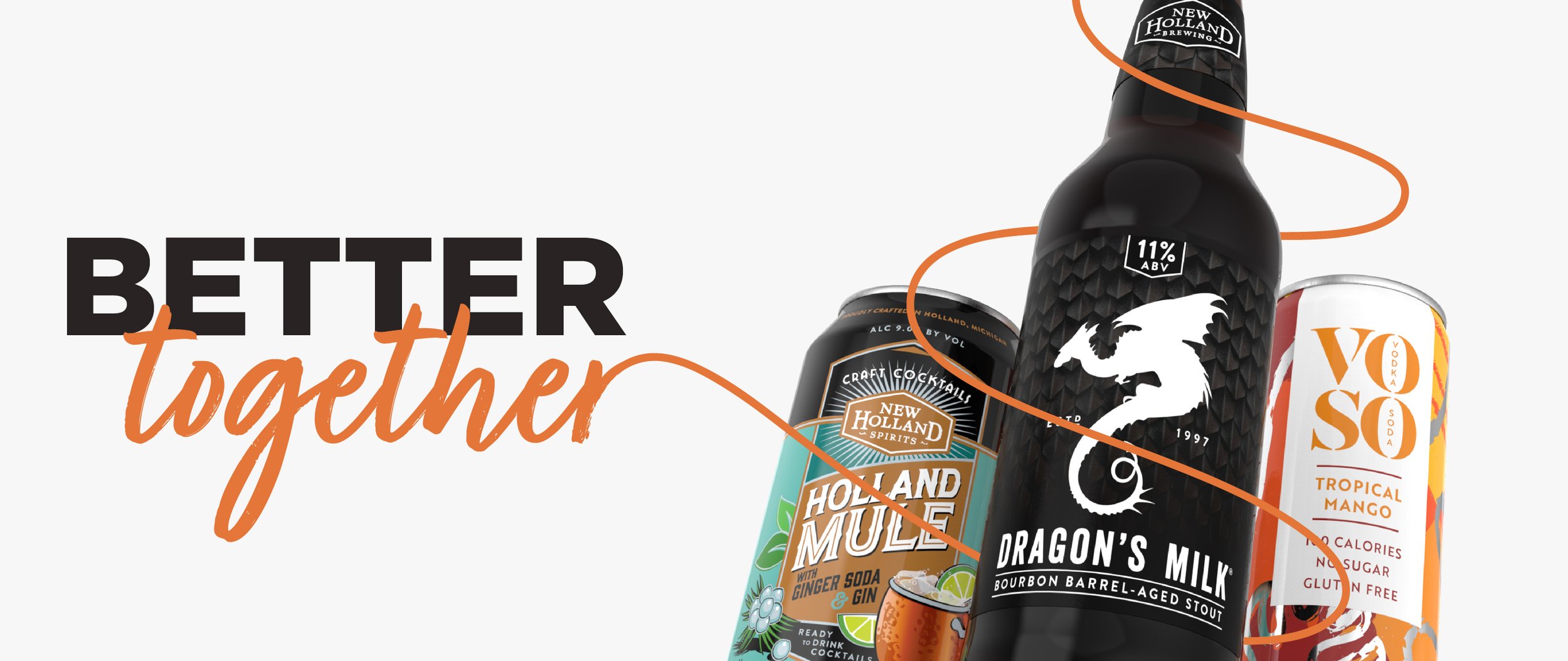
Better Together
One of the most prolific small makers of alcoholic beverages, New Holland Brewing Company, has no shortage of talent and vision for creating a wide range of unique beers, ales, seltzers, malt beverages, and even distilled spirits. Each of those creations has a unique character and a story to tell in its own voice. This is where the long-term relationship between COHO and New Holland comes into its own. With each innovation, we work together to create a meaningful visual and verbal story that resonates with the consumer and their lifestyle—smoothly integrating each new line into the New Holland brand family.
A Unified Brand
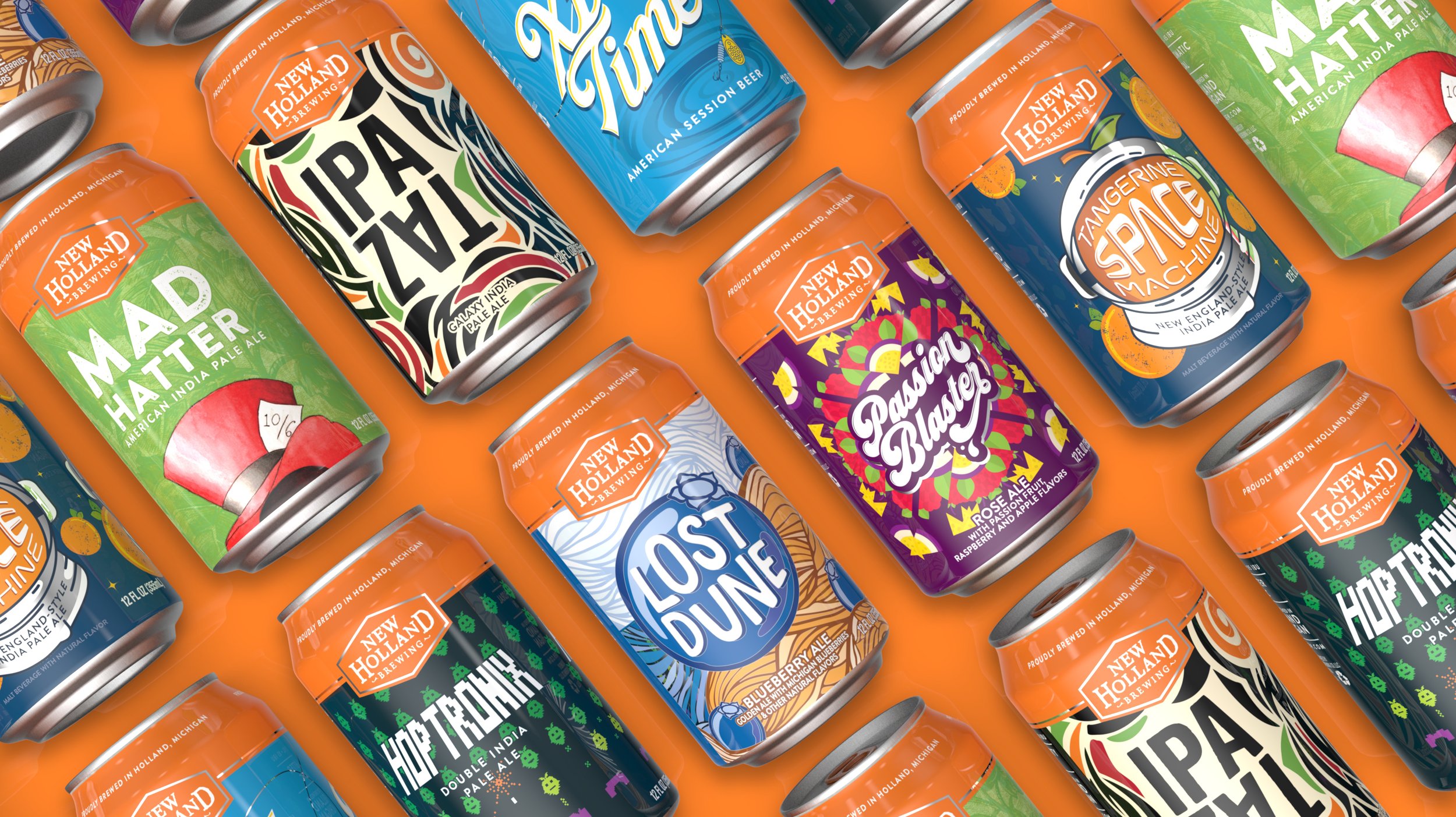
The first thing COHO and New Holland did was create a design architecture that showcases the character of each beer while unifying the line under the master brand. We start with orange. It’s the national color of Holland, which is both the brand’s namesake and heritage deeply woven into the Holland, Michigan region. A bright band of orange houses the master logo consistently across all products, and the cans’ pull tabs are even orange anodized. Then we created distinctive illustrations and designs for each beverage and staged them on the remaining visual real estate. Every product has its own character, from Mad Hatter and Passion Blaster to Tangerine Space Machine, TAZ IPA, Hard Kombuchas, and even seasonal varieties. Still, they work together under the New Holland brand.
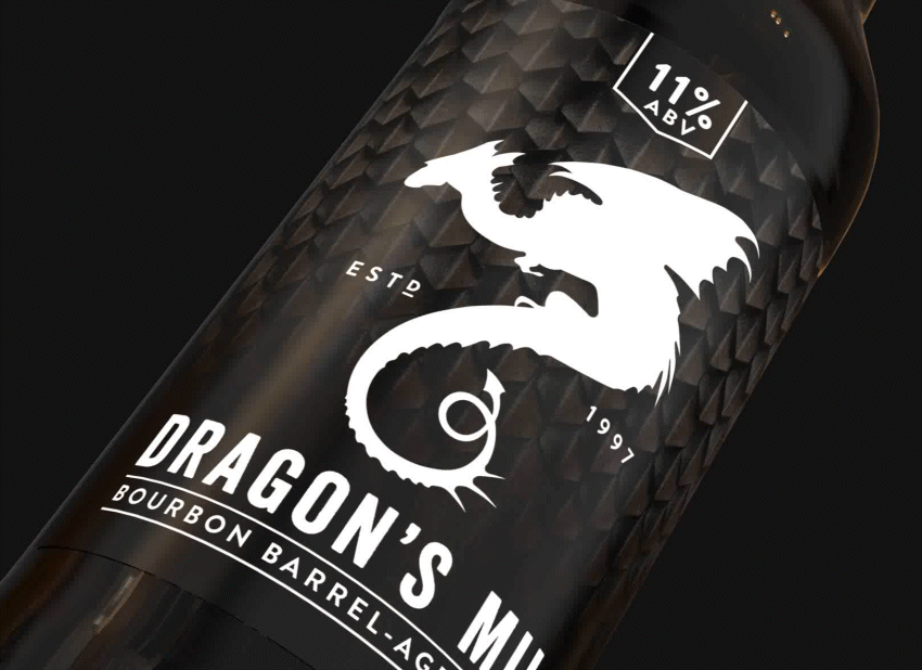
Dragon’s Milk
The first bourbon barrel-aged stout to hit the market, Dragon’s Milk is the most anticipated of all New Holland’s annual releases. We created a new brand and packaging that brings the storied legend to life. The dragon comes front and center as a white silhouette, but the design allows the imagination to finish the tale like a great storyteller. The ominous dragon scale background brings the mythic beast so close you can touch it, and other graphics show the bourbon barrel process and other communications in a thematic way that keeps us immersed.
Craft Cocktails
Always restless for the next innovation, New Holland began producing ready-to-drink craft cocktails. Building on our established New Holland design system, COHO created a variation designed specifically for craft cocktails. This new iteration integrates fresh and fun illustrations that bring the character of each spirit to life in a way that takes us back to the classic era of mixology.
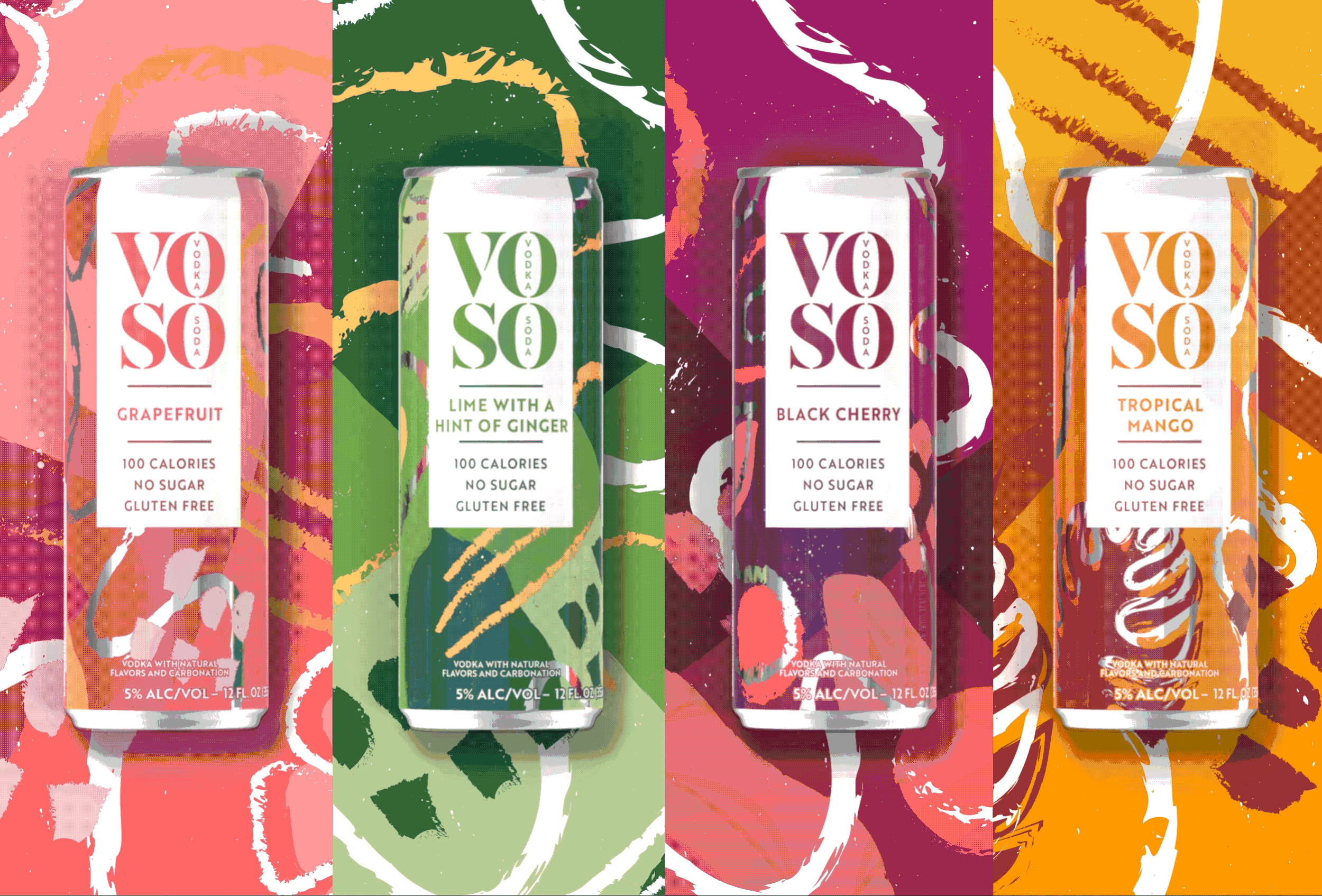
VOSO
With the popularity of premixed craft cocktails, New Holland created VOSO, a vodka soda named after its ingredients. This exciting departure from the brand’s traditional offerings had to compete as a more sophisticated drink in a hectic, high-energy category. To separate it from the crowd and connect with the cocktail’s light, refreshing, savvy character, we start with cues from art and fashion. The logo fonts might be found in the New York or Paris fashion scenes. The background textures work as a set across the line and feel like abstractions you might find in contemporary art, each embodying its flavor without being blatant. A clean white space is knocked out of the background to center stage the logo. A light offering, the can is tall and skinny. The overall effect is a sense of fun but sophisticated energy.