PLACKERS
Oral hygiene chore becomes a healthy habit made simple.
Plackers is the brand that revolutionized flossing with the floss pick over 40 years ago. But, with significant changes and new competitors in the category, Plackers needed to reset and refresh to regain prominence.
Client
Plackers | Brand Relaunch
Category
Oral Care
Services
Consumer Insight
Landscape Assessment
Inspirational Consumer Targets
Positioning & Charter
Naming, TOV & Messaging
Design Strategy
Brand Identity & Experience
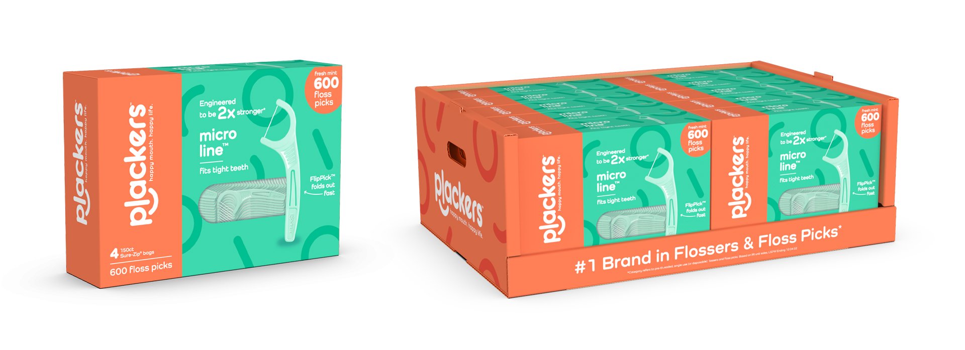
Package Design
Brand Assets & Imagery
Realization & Commercialization
Awards
GD USA | Packaging Award
PAC Global Awards | Revitalized Brand, Non-Food - Best in Class
Addy Awards, Cincinnati | Logo - Gold, Packaging - Silver
A Category Reinvented
Do you know those handy little plastic-framed dental flossers? They’ve gained significant popularity over traditional floss. They’re convenient, easy to use, and appeal to a younger consumer.
The most prominent and newest entries have recently staked out premium positions with high price points. Private brands and others have grabbed the cheap seats. This crowding meant Plackers needed to reassess where to play and how to win.
Generational Levers
As always, the key to success lies with the consumer. Similar in many categories, a momentous generational “passing of the baton” is underway, from Boomers to Millenials & Gen Z. So how does a brand with strong Boomer loyalty maintain its base while building new relevance with a much younger audience?
Plackers decided to partially return to what made it initially successful. Helping users simplify their oral care routine while taking on a more youthful, joyful, and relevant personality & voice—positioned to win with consumers of all ages.
Winning With Fun
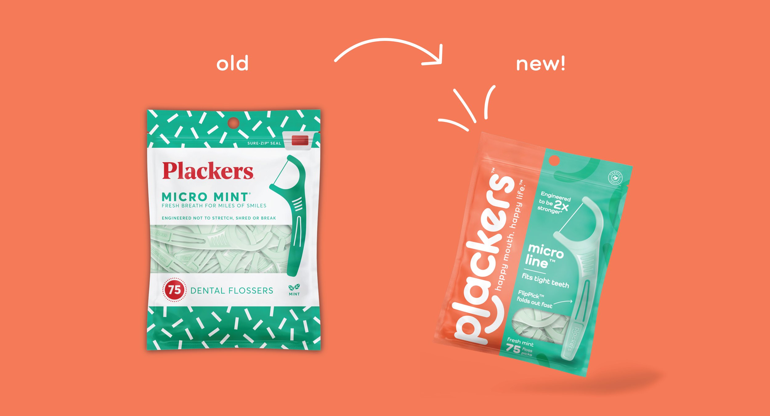
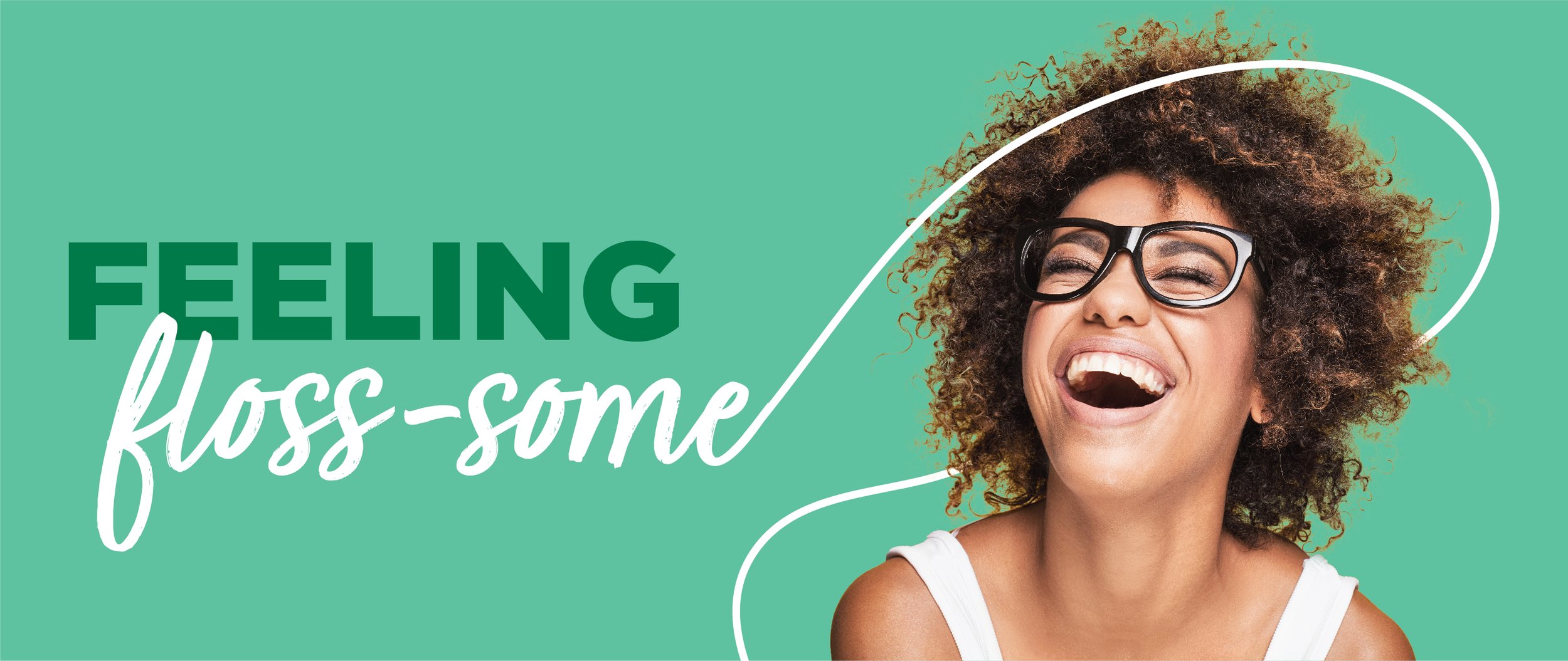
Verbally and visually, the new Plackers brand eschews the competition's expected positioning: clinical, overly technical, and stern.
Instead, Plackers sets a new standard with its refresh. It’s possible for a well-engineered and efficacious product not to take itself so seriously. Rather, Plackers demystifies the complexity of oral care with simple yet clever language, approachable, bright colors, and a lighthearted identity.
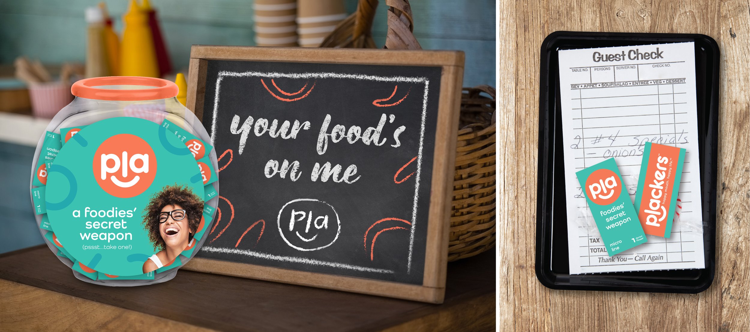
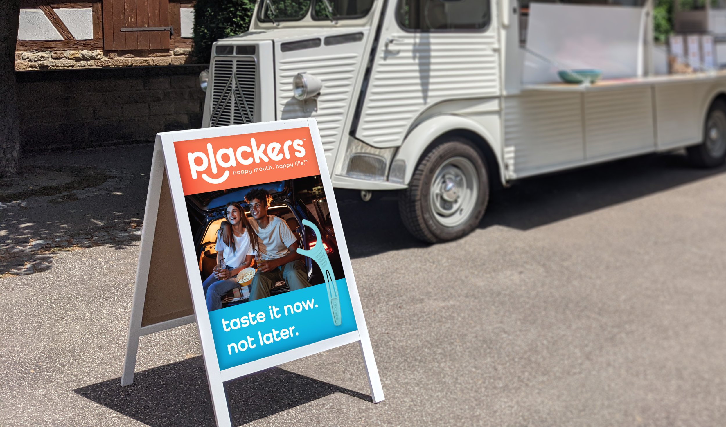
The new brandmark—with a smiling face and soft letterforms—immediately lets us know that this will be a lot of fun. The tagline, “Happy Mouth. Happy Life.” sets the tone, and the content brings it to life with vitality and joy across all touchpoints. The tone is often tongue-in-cheek and irreverent, but never misses a chance to inform and educate. The image style follows suit, welcoming people of all ages to the brand, capturing quirky, unposed moments filled with rich personalities and real-life joyful fun.
This new brand personality is now consistently executed across packaging, social, digital experiences, and beyond. So, we get that Plackers is on a mission to turn what many consumers consider an oral hygiene chore into a healthy habit made simple.
Experiential Choices •
Color •
Pattern •
Typography •
Logo •
Tagline •
Form Language •
Iconography •
Photography •
Naming •
Illustration •
Brand Symbol •
Experiential Choices • Color • Pattern • Typography • Logo • Tagline • Form Language • Iconography • Photography • Naming • Illustration • Brand Symbol •