KIRK’S
How do you make a brand relevant to a new generation without losing almost 200 years of authenticity?
Natural soaps are gaining ground again as the trend toward simpler and less artificial ingredients continues to grow. Having the fortunate position of being an all-natural soap since its creation over 180 years ago, Kirk’s was able to pursue new growth with a brand renovation that both modernized and honored its heritage.
Client
Kirk’s
Category
Personal Hygiene | Soaps & Cleansers
Services
Consumer Insights
Positioning & Charter
Brand Identity & Experience
Package Design
Realization & Commercialization
Background
In 1839, Kirk’s was established with the idea that everyone deserves natural cleansers. And the brand has stayed true to that belief over nearly two centuries through family ownership, acquisition by Procter & Gamble, and back to family ownership. So with the Millennial cohort’s growing passion for natural products, Kirk’s certainly had the substance to appeal to them. But the brand had become dated and wasn’t telling its natural story in a way that contemporary audiences could connect with. A significant brand update was needed, but through a mindful approach that didn’t lose authenticity, equity, and heritage.
Brand Strategy
Starting with the consumer, Inspirational Design Targets were developed. This process helped the brand empathize on a personal level to better understand its consumer audience’s functional and emotional needs.
A landscape audit then revealed opportunities for how Kirk’s could stand out with an authentic promise, a genuine personality, and refreshed design equities. These insights led to a collaborative process we call The Brand Charter, where the brand’s new strategy was codified through promise, values, personality, benefits, and RTBs. It would effectively guide Kirk’s brand expression over time.
Design
With brand strategy established, design strategy began with territory exploration. Kirk’s has a uniquely American success story. It’s also a natural clean story. Merging these ideas and exploring their expression led to a compelling visual language and ownable brand identity.
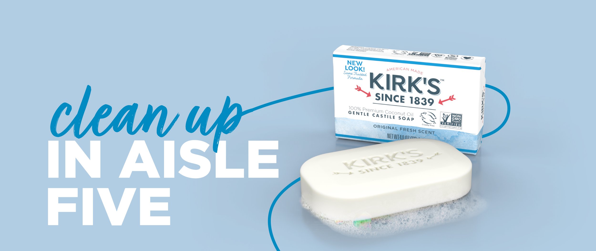
The logo and typography were updated to feel fresh and contemporary, and emphasis was placed on making the brand name more prominent. Through research, we discovered that some old equities—especially the arrow—had surprising relevance to consumers.
Color also posed a unique challenge because what’s cleaner and more natural than white? Yet a versioning system was needed for shoppability and scalability. We arrived at a watercolor effect, its subtle simplicity providing almost limitless flexibility with a clean, humble honesty that aligned with Kirk’s personality.
The Kirk’s tone of voice was then explored, a verbal strategy set, and conceptual creative executions developed to inspire marketing touchpoints. Finally, a brand book was created, capturing strategy and design clearly to guide all future communication efforts.
Results
Kirk’s agreed when a holistic approach was recommended beyond the package, and it paid off. The new brand experience embodies natural wholesomeness across all touchpoints and intuitively houses the innovations and affiliations they choose to adopt. It also gave Kirk’s opportunities for wider distribution beyond natural channels.
The new brand celebrates Kirk’s as a cruelty-free, vegan-certified, non-GMO verified, and highly philanthropic WBENC business. It has strengthened Kirk’s loyalty with legacy consumers and established a relationship with a new generation of consumers committed to more natural lifestyles.


